Home
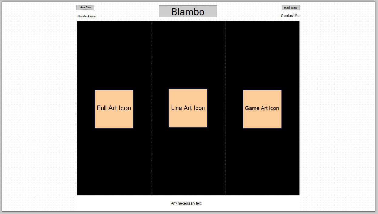
The main idea of having a home page was to be able to select between
the three prominent art styles in Ray's collection which are "Full Art"
"Line Art" and "Game/Pixel Art". For desktop users the page opens with a
slideshow arrangement where the main level of intrigue is the movement of
the panels. When the user hovers the the icons they will notice that they
are selectable and given an icon that hints at the type of the art present.
After Selection
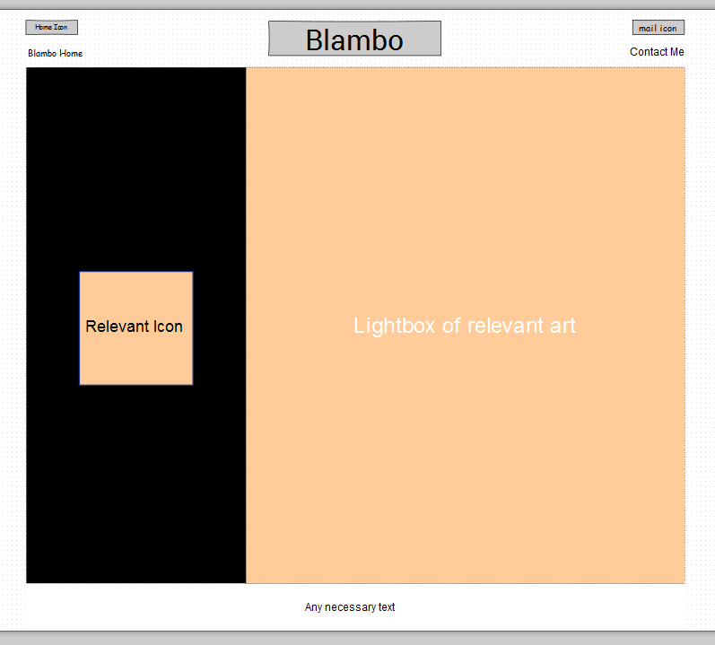
After the user makes a selection of the type of art they want to see
they are then presented with the post-selection view. This view gives them
a bar on the left side that informs them of what choice they have made.
Then to the right is the large spacing dedicated to lightboxes of the
relecvant art style. It should be noted that the menu is 25% and the
light box panel is 75% of the filled space to give plenty of breathing room.
Contact and Commission Page
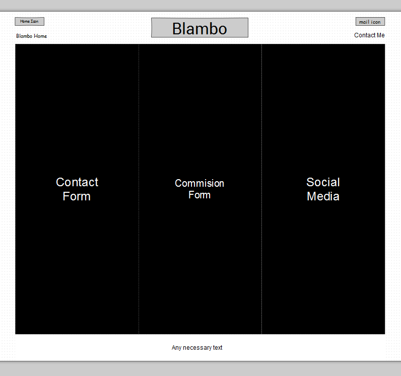
The contact page seeks to be fairly straight forward and uncluttered while
retaining the same three panel view that the rest of the site takes on. Upon
hovering over one of the panels it will light up and be more of an interactive
view of the content.
Mobile Version
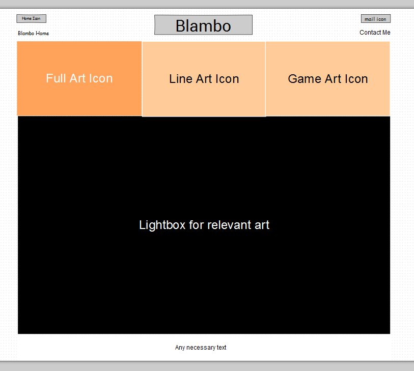
The site aims to be both adaptive and reponsive, so that at certain widths
it changes view to a new layout suitable for mobile consumption from a tablet
or phone. This also applies to users that are windowing the site to be very thin.
This view ligthens up significantly on moving visual elements.